Like most Erin Condren fans, I waited with eager anticipation for the launch of the new LifePlanner back in June. I ordered a day or two after the launch, and only just received my order. With all of the changes the company has made this year to the LifePlanner, the launch was super successful, hence the long wait. That and I live in Australia, so shipping takes a while. Luckily, the wait was worth it!
 |
| Belle getting in on the Erin Condren action |
 |
| The gorgeousness that is the Rose Gold Life Planner |
So, what are the changes the company has made? All great ones in my opinion, and I will list below :
+ Rose Gold option (although currently sold out!).
+ Horizontal layout and a vertical layout option (the original EC style).
+ Removal of the 'busy-ness' on the pages. The old 'morning, day, night' headings have been removed from the columns, unnecessary decorations have been removed from the weekly spreads, and an overall 'clean' look is given to the planners.
+ A pastel/jewel colour theme for the new horizontal layout (one of the main reasons I ended up choosing the horizontal layout, I detested the October colour scheme in the vertical!!), as well as matching standard stickers.
+ A ruler that is less busy also, so is practically see-through.
+ A prettier plastic pocket with no red strip (did anyone else really dislike that red strip??).
+ A notes page at the beginning of each month, with a quote on the opposite page (rather than at the top of each monthly spread like previous years).
+ A monthly goal setting section.
+ A 'thankful thought' box in each weekly spread rather than a mini calendar. I think this is a really sweet idea!
+ A fancy foil and velum cover pager when you open the planner.
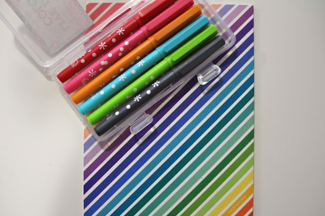
+ New markers (purchased separately) that are slightly different in colour to the old ones and do not bleed through the pages.
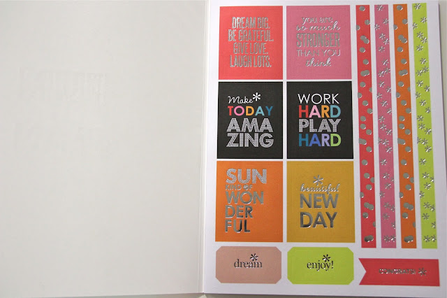
+ A new sticker book (purchased separately) full of gorgeous foil stickers to decorate your planner (Yes, that is a thing. And yes, I participate...).
+ A larger coil able to support the ever-expanding LifePlanner as the year goes on.
+ Graph paper in the notes section.
(apologies for the quality of the photos in this post - no natural light and fluro lighting make for verry average photos, but I tried my best give the circumstances! Oh how I can not wait for natural lighting in our new house!!)
 |
| The oh-so-fancy velum cover page |
 |
| A page to map out your dreams and goals for the year |
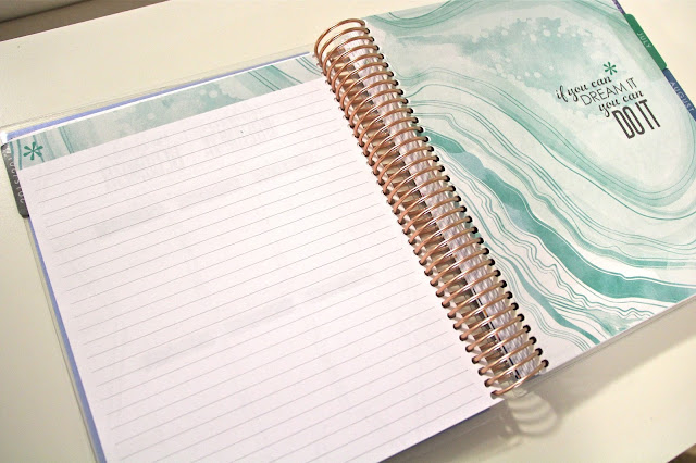 |
| The notes and quotes page at the beginning of each month. My favourite by Walt Disney! I wonder why they don't reference the quotes... |
 |
| The monthly spread. See how gorgeous the new colour scheme is? |
 |
| The horizontal layout. I love that lines are included in this. Helps my big writing be not-so-big. |
 |
| Closer views of the layout. I love how each month only has one colour theme. Makes decorating easier! |
 |
| I am excited to start decorating this layout! What would you use the box on the right for? |
 |
| The new graph paper. Not sure what I will use this for. Perhaps room layouts for the new house?? |
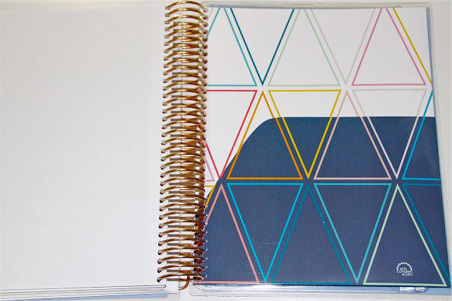 |
| The new keep it together pocket. Some have said it seems stronger but I disagree. It is just shiny rather than matte. |
 |
| The pretty new pocket! |
 |
| New jewel tone stickers |
 |
 |
| Isn't the back cover lovely? |
Because I live in Australia, I ordered a few extra items so didn't have to pay for postage again for a few small items I regretted not getting to try out in my last order. My order looked a little like this :
+ Rose Gold Horizontal 18 month LifePlanner
+ LifePlanner Launch Bundle, which includes the sticker book and markers
+ Coil Clips
+ Snap-in meal planner
+ Snap-in to do list
+ Designer dots - both do it all and daily dots.
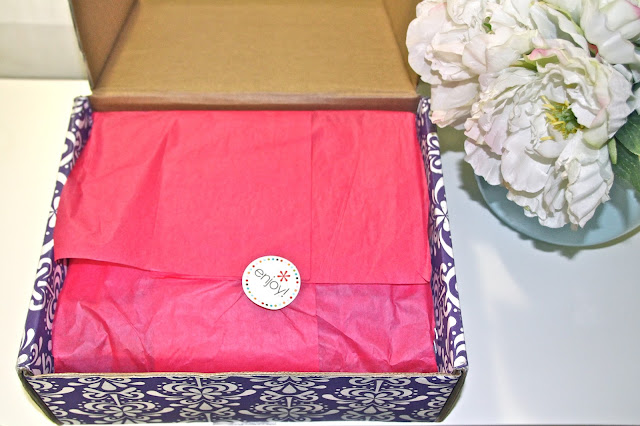 |
| I love how EC packages all orders. |
 |
| Opening the box! |
 |
| Here you can see everything except the Designers Dots, I'm not sure where they were hiding... |
 |
| View of the snap-ins. Not sure if I will use these all the time but handy to have! |
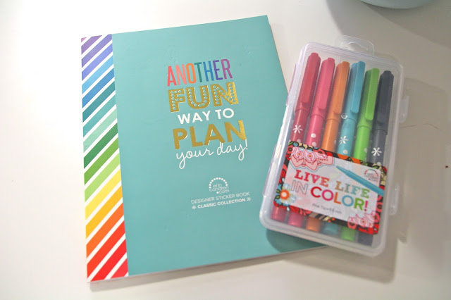 |
| Sticker book and markers |
 |
| A few pages of the gorgeous stickers. There are 10 pages within the book. Pretty good I thought! |
 |
 |
| Colour-coded Designer Dots stickers! |
 |
 |
| The markers write beautifully and I will have a go at using them instead of my trusty Staedtler Triplus Pens. |
I am extremely excited to start planning in my new beauty. I have been stalking people's Instagram and blogs for weeks for inspiration on how to plan in the horizontal spread and I'm keen to put my own spin on it. I'm not one of the super 'busy' decorators that cover every inch of the week in stickers. I like adding a bit of colour and fun, but in a practical sense. I do, however, still appreciate those types of scrapbook spreads!
If you are thinking about placing an order with Erin Condren, I have a special link where you can receive $10 off your first purchase! For full disclosure, it will also give me $10 off my next purchase, but sharing is caring, correct??
And one more thing before I sign off - those of you that have purchased EC previously, have you experienced the annoying 'peeling' or separating of the cover corners? This has happened to both my Teacher Planner and LifePlanner. A simple solution is to run your GHDs over the damaged corner very quickly a few times. This re-seals the plastic and by doing it quickly, you don't distort the shape or melt it completely! You're welcome! ;)
Happy Planning!

0 comments:
Post a Comment